In collaboration with our friends at Team XYZ

The value of a positive website user experience can’t be overstated when it comes to making a lasting impression for your brand. User experience, often shortened to UX, includes all the ways visitors interact with your site, from initial loading times to the overall interaction between you and your audience. An effective UX design can help you ensure a positive association between your website and the interests of your customers.
Unsure where to begin? You know we’ve got you covered. We’ve collaborated with our friends at Team XYZ to share seven brand website user experience tips to make an impression. More than just tips, we’re also showing off .xyz websites who are the talk of the trough and putting these tips to use!
Website User Experience Tips You Should Be Following
A positive brand website user experience makes a lasting impression that keeps your customers oinking about how great you are. These organic brand ambassadors play an invaluable part in spreading awareness and boosting your reputation. To build a strong online presence, complement your unique domain name and SEO strategies with an overall UX that will keep visitors coming back! Some website user experience tips to follow and make a great impression for your brand are:
- Create a logo that communicates your identity and values
- Include helpful customer resources
- Use a distinctive brand voice
- Create an easy-to-navigate experience
- Make eCommerce easy
- Incorporate a consistent color palette
- Provide ways to make contact
Create a Logo Showcasing Your Identity and Values
First up on our list of brand website user experience tips is to create a logo that showcases your identity and values. Your website is one of the most essential elements of your brand. It’s how most of your audience will interact with your business and learn about your brand identity. Creating a brand logo that communicates your values and services will keep you top of mind. Apply it to social media pages, merchandise, business cards, and most importantly, your website! Make a lasting impact and visually express your purpose with a logo that speaks to who you are.
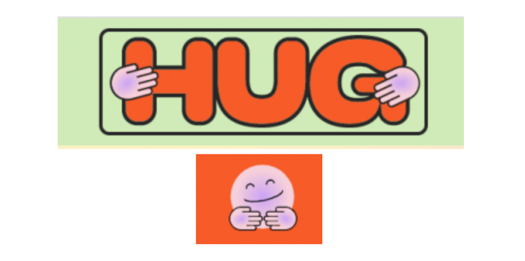
TheHug.xyz is an example of a community-focused website that has branded with a logo that communicates their values. The platform was created by Facebook Live creator Randi Zuckerberg and venture capital firm M13 founder Debbie Soon. The logo is designed to embrace and empower all Web3 creators, especially women, non-native English speakers, BIPOC, people with disabilities, neurodivergent people, and LGBTQ+ folks.
HUG features branding using two specific logos: one is a happy emoji enjoying a hug while the other is the word “hug” adorned by the same two hugging hands featured on the emoji. These logo choices communicate the platform’s interest in embracing, advising, mentoring, and empowering aspiring web3 creators of all kinds, highlighting their focus on inclusivity.
Developing a logo that helps visitors understand your brand, remember your website, and communicate your core services creates a website user experience that leaves a positive lasting impression.
Include Helpful Customer Resources
Customers want to easily find the information they need without having to dig through irrelevant information. Part of learning how to improve user experience on a website is to provide that information as quickly and easily as possible. To lead customers to answers and solutions to their questions, successful sites include helpful resources like FAQs, tutorials, instruction guides, a Knowledge Base, or related articles. The key is to anticipate their problems and readily provide the solution they need.
Sites that don’t offer helpful resources risk giving visitors a negative brand website user experience and losing out on conversions. You’re not just losing that potential customer, but losing out on potential customers with whom they speak or share their experience. A frustrated customer on your site could become multiple new customers for a competitor.

An example of a website that makes a wide assortment of resources readily available to its visitors is ForceofNature.xyz. This non-profit organization is dedicated to helping young people turn eco-anxiety into action, and work with leaders to drive intergenerational solutions against climate change. They pursue this goal by leading student programs, speaking at schools and universities, and creating a curriculum with supporting resources for educators. The website features a Resources link where students and educators can acquire all the helpful materials they need to utilize the organization’s services.
For teachers, Force of Nature offers continuing professional development in the form of training sessions to help educators respond ethically to climate change concerns, navigate difficult conversations, and create spaces that promote wellbeing. One of their most prominent resources is the Climate Anxiety Discussion Guide, a 4-module discussion guide aimed to facilitate conversations about the climate crisis while safeguarding young people, navigating strong feelings, and fostering emotional resilience. They even created a video that highlights the purpose of the guide, serving as a useful resource, itself.
The brand website user experience for Force of Nature doesn’t stop at adult leaders. For students, they offer programming intended to foster change by helping them uncover interests as aspiring activists and clarify what they need to be effective as change-makers.
By featuring helpful resources on your website, you can leave an impression of preparedness, thoughtfulness, and a dedicated interest in earning and retaining the attention of your visitors. It’s an invaluable website user experience tip you’d be remiss to ignore!
Using a Distinctive Brand Voice
Brand voice is next on our list of website user experience tips to make an impression on your audience. Let’s face it, today’s market is highly saturated with brands all trying to get customer attention. What makes you something for visitors to oink about?
Creating a brand voice that serves as a central throughline in all your communications lets you engage with your audience in a personal, authentic way. If your brand was a person, what personality traits would they take on and how would they speak? What does your audience vibe with? A distinct brand voice can make your website user experience into something memorable, retaining customers and expanding to new ones! Find your voice and give your brand a personality.
Brand the specific personality that a brand uses in all of its communications. Particular people likely stand out to you because they’re great talkers and storytellers, and do so in a unique way. That is the type of memorability and lasting impression you may want from your brand voice. If your brand was a person, what personality traits would they take on and how would they speak? How would that person respond in different situations? Taking that into consideration can help you develop your brand voice. This voice can then be applied to every
communication from your brand, especially your website. A distinct brand voice can help your website stand out from the crowd and give your brand a personality.

We couldn’t possibly leave you hanging without an example that hogs the spotlight when it comes to effective brand voice. NaN.xyz describes themselves as an exploratory and service-driven type design practice, creating for and collaborating with the weird, the wise and the wonderful. They’ve adopted a very specific brand voice that serves them well as they collaborate with leading agencies and global brands. They pride themselves on creativity and whimsy, saying they can be found “at the intersection of serious and slap happy.”
Throughout NaN’s website, users discover a true understanding of their witty and tongue-in-cheek personality. In the descriptions of nearly every typeface offering, there’s something that will make users smile. For example, the description of font NaN Holo reads, “Think about your favorite hairdresser that you’ve known for years. Holo is the AI recommended automaton which replaced your hairdresser without you even noticing.” They’ve nailed down a distinctive brand voice that brings charm and personality into their business. It makes it something personal that customers feel a connection to instead of a clinical, sterile approach that reminds them it’s a business transaction.
NaN.xyz doesn’t miss an opportunity to inject a distinctive brand voice into everything on their site. Developing a distinctive brand voice helps your website stand out, express an endearing personality, and leave an impression your customers won’t forget. Need we oink more?
Make Site Navigation Easy for a Better User Experience
The brand website user experience doesn’t just rely on information visitors find, but also how easy it is to navigate your site altogether. Focusing on easy site navigation combined with an internal linking structure is an easy way to keep visitors on your site longer, leading to a higher chance for conversion. The UX design should be one of the top priorities for any brand looking to make an impression for the right reasons.
Well-planned site navigation helps visitors find the information they were looking for quickly and easily. It also provides them with information they may not have realized they needed, building your reputation as the go-to for them in the future. From a web design perspective, a user-friendly interface that’s easy to navigate also showcases your brand as well-organized, customer-focused, and knowledgeable.
A website with pleasing visuals, engaging content, and helpful resources readily available demonstrates that you value your customers. It’s similar to methods for how to attract customers to your online store. Showing an unparalleled interest in your customers also encourages word-of-mouth advertising and organically increases brand awareness over time.

Islands.xyz is a social profile for all your NFTs regardless of which wallet or blockchain they are issued on. As a long-scrolling website, they’ve ensured most of the information is contained on one long webpage and that visitors can access what they need without a need for multiple clicks.
With the wealth of information presented on a single page, visitors can simply scroll down without the need to click off the page or over to a different website. There are additional menu options found on the top of the page, including a career opportunities page, but most of what a first-time visitor may wish to learn about is available to them right from the homepage. This simple navigation design improves the brand website user experience as it takes the guesswork out of where to find the info they’re looking for.
This type of page format fosters natural storytelling. Engage visitors in your brand’s story with a creative design using a clear beginning, middle, and end. By adding dynamic content like imagery, you create a level of engagement that helps your audience absorb your information and gain a complete understanding of your services without having to click through multiple pages.
A navigation design that clearly leads your customer down a distinct path with minimal distractions or causes for confusion helps them find the content they’re looking for quickly and easily. It’s also an effective strategy for keeping visitors on your site longer, improving conversion rates, and decreasing your bounce rate.
Make eCommerce Easy
If your site includes an ecommerce store, then your brand website user experience just got all the more important! While site visitors may forgive the occasional necessary venture into a resource hub to learn more about a cause or event, online shoppers expect a flawless experience or they’ll take their business elsewhere.
The key to increasing sales and boosting the website user experience for ecommerce brands is with an effective online storefront. Your online marketplace should seamlessly guide customers through the process of making a purchase while taking the opportunity to suggest additional complementary purchases without crossing the line into being pushy. An easy-to-use marketplace from beginning to end (don’t ignore the checkout process!) can make or break your brand.
To boost your brand website user experience, include a wealth of product photos, specifications, and interesting details to make your customer feel as informed as possible. This reduces their reluctance to make a purchase and leaves a positive impression of your website.
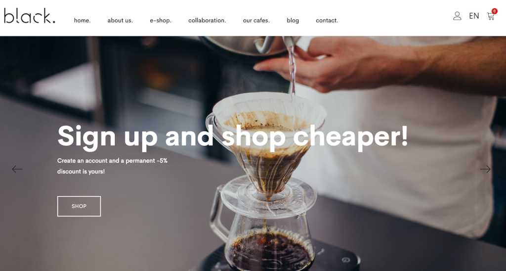
As always, we’re bringing an example to the table of how to make ecommerce easy! Black.xyz is a specialty coffee roaster based in Bratislava, Slovakia. Their e-shop section is a prime example of ecommerce that is impactful and easy to use. Black.xyz’s knowledge of their coffee is evident in how they describe each type they carry. They use detailed descriptions to explain each variety and place of origin so the customer feels very well informed.
For example, their Tanzania Blackburn coffee is meant to be light and citrusy with notes of lime, tangerine, green tea body, grapefruit acidity, and an herbal honeydew finish. If customers are looking for a bolder variety, they can easily see the Black Sheep blend is more full bodied with notes of dark chocolate, wild berries and dried stone fruits.
Each product description on the site includes photos of the front and back of the packaging as well as images of the rich coffee beans. Has us ready to pig out on our morning coffee in a whole new way!
A thoughtful and customer-focused eCommerce platform establishes trust, boosts revenue, and encourages return visits to your website. Don’t miss out on the chance to increase the website user experience in such a meaningful way.
Incorporate a Consistent Color Palette
Just like a distinctive voice shows off personality, incorporating a consistent color palette also boosts the brand website user experience while leaving an impression on your visitors. Starting with your logo and following your brand across the site, social media, and more, color choices influence how people perceive your business. Color affects mood, shopping habits, and how visitors engage with your brand.
Successful brands carefully choose their color schemes to build the vibe of their business and affect brand awareness over time. It’s not by chance that people recognize McDonald’s red and yellow color palette across the globe. Google’s website features a primarily white background, with their logo using distinctive traces of blue, red, yellow, and green. .XYZ uses purple, which studies suggest can represent courage, creativity, mystery, and magic. Studies in logo color psychology show that your logo color becomes a shortcut for visually conveying details about your brand.
Colors establish familiarity and are part of what makes your brand memorable. After all, you can’t tell us you don’t recognize Porkbun Pink, right? That’s what we thought.

Want to see who else is doing a pig-nificent job of keeping a consistent color palette? Wunks.xyz. True to the spirit of .xyz domain names, Wunks is a community platform centered around a collection of 6,000 NFTs aimed at paving the way for equity of access in the NFT space. The NFT collection has the tagline “Women Punks with Purpose” and is inspired by the Cryptopunks, Larva Labs Studios’ original NFTs that debuted in 2017.
Throughout Europe and the United States, the color pink is thought to be a calming color commonly associated with love, kindness, and femininity. Wunks is taking ownership of that color and applying it to their website to pay homage to influential women and to attract more women to the web3 space. The easy-to-navigate website is rich with dark hues of pink, broken up by images of Wunks NFTs that feature a pale pink background.
Expertly using their signature color in a variety of ways to make a splash, Winks includes a pink call-to-action (CTA) button against a black background to encourage visitors to join their Discord community. The color palette and design of Wunks.xyz helps the website express female empowerment, representation, and equity.
Establishing a pleasing and strategic color palette on your website communicates a feeling, creates a memorable association, and generates an impression of familiarity that encourages your website visitors to return. Have fun with it and make it an expression of your brand!
Provide Ways to Make Contact
Last up on our list of brand website user experience tips to make an impression is to provide ways to contact your business. You’d be shocked at the number of brands who discount the importance of easy contact. There’s nothing more quickly frustrating to site visitors than having a question or needing assistance without a way to communicate that.
Contact information improves the website user experience and contributes to on-site SEO efforts meant to improve organic searchability. Without easy access to your contact information, you risk losing customers to other businesses. Providing contact information is more than just a convenience, it adds legitimacy and professionalism to your brand. Do you trust someone you can’t reach? We don’t either.
A “Contact Us” page should be easily found and provide site visitors with a contact email address for them to reach out. It may also include information such as a business address or phone number. Many brands embed a customer contact form on this page, which allows site visitors to email your brand directly without having to visit a separate email platform.
You may also opt for a live chat option, which helps customers chat directly with a customer service representative during regular support hours (peep the Porkbun “Help” button at the bottom right of the screen on our site). Social media sections containing Facebook, Instagram, LinkedIn, Twitter, and other platform profile links are another great way to provide access with the added bonus of building your following and interacting with potential customers who may have questions.

ArtsandLetters.xyz is an example of a website with a simple-yet-effective contact page. This independent creative agency, based in Richmond, Virginia, has clear navigation in their site header for visitors to reach their contact page. The page features three different email addresses to use, depending on whether you are proposing new business, seeking public relations assistance, or simply want to say hello.
A contact page that clearly provides your contact information generates trust and demonstrates your brand’s interest in hearing from potential customers.
Enriching your website user experience helps you build a strong online presence and develop a strong brand. Recognizing the importance of your visitor’s experience helps you rank better across search engine results pages, build better brand awareness, and boost your reputation. Follow the examples of these well-designed .xyz websites and make the best impression possible! Register your .xyz website today. OINK!